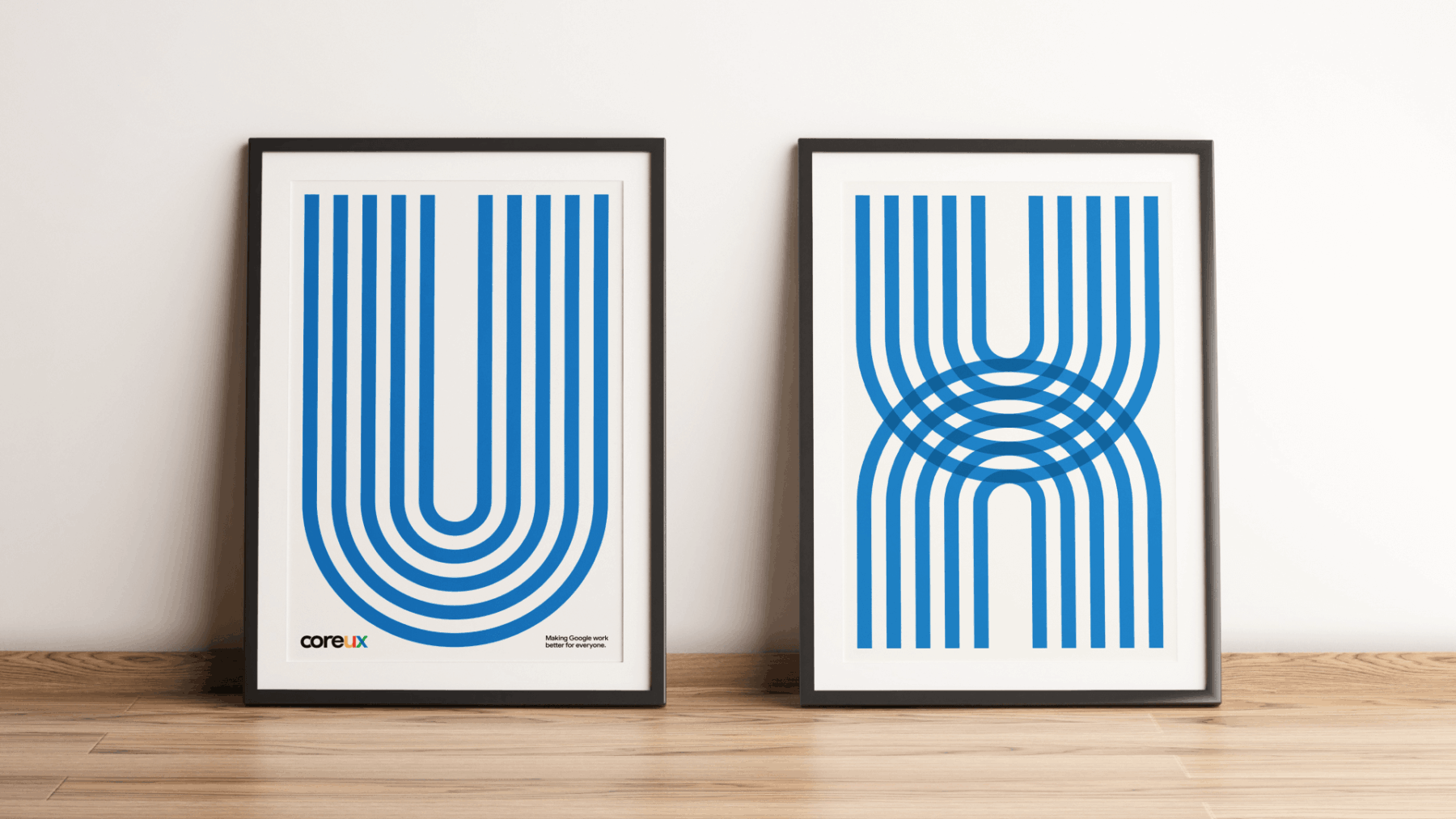
How do you create a visual identity that will help a brand both stand out and fit in? That’s exactly what we had to figure out for Core UX—a new organization looking to claim their position within the Google ecosystem. To achieve this delicate balance, we got started with a deep discovery phase and close, integrated collaboration.

Core UX Identity

With weekly working sessions, we partnered with the Core UX design committee to identify key takeaways, goals, and attributes that made their org stand out. What we landed on was a visual identity that would position Core UX as the organization making Google work better for everyone.
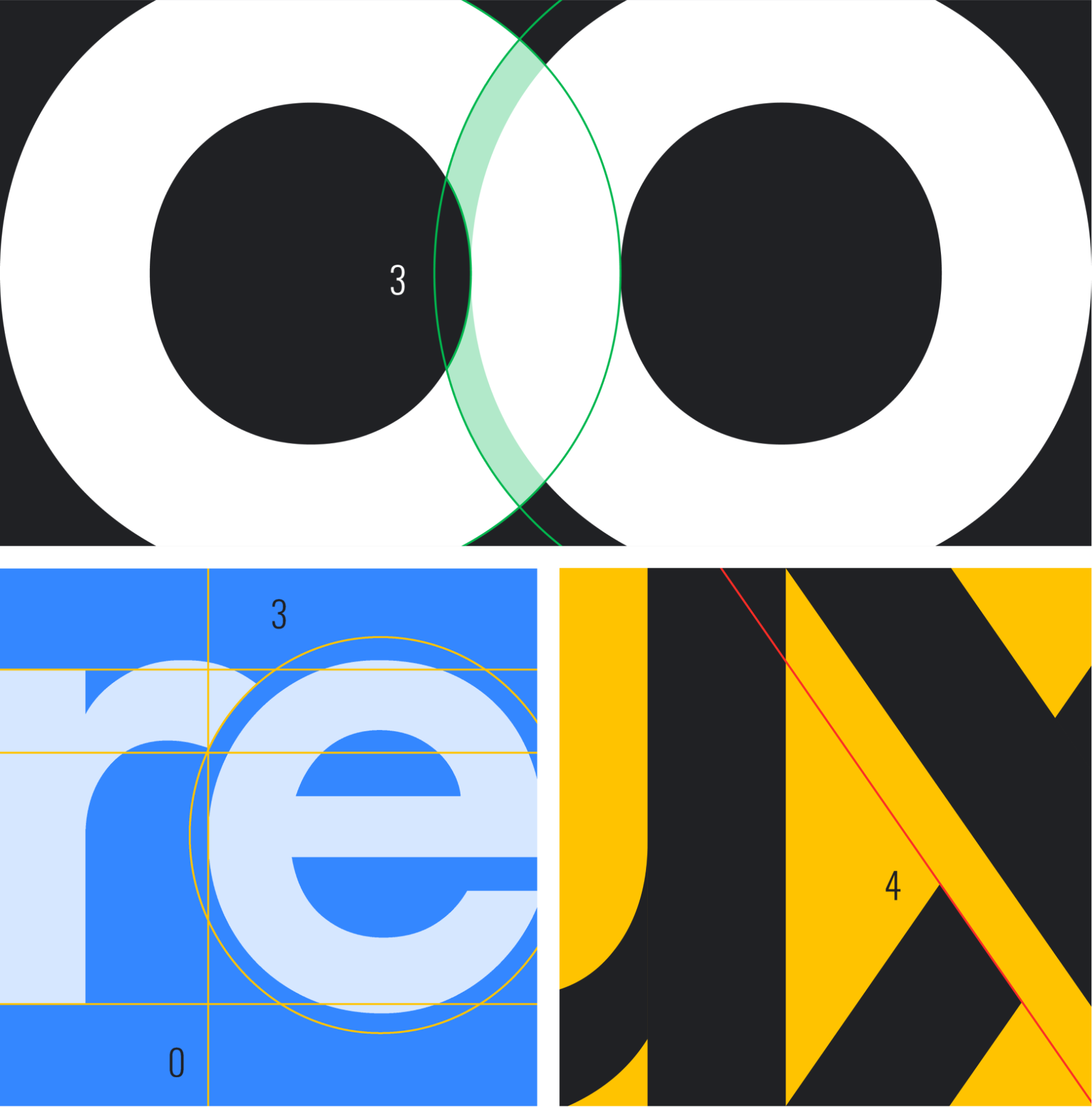
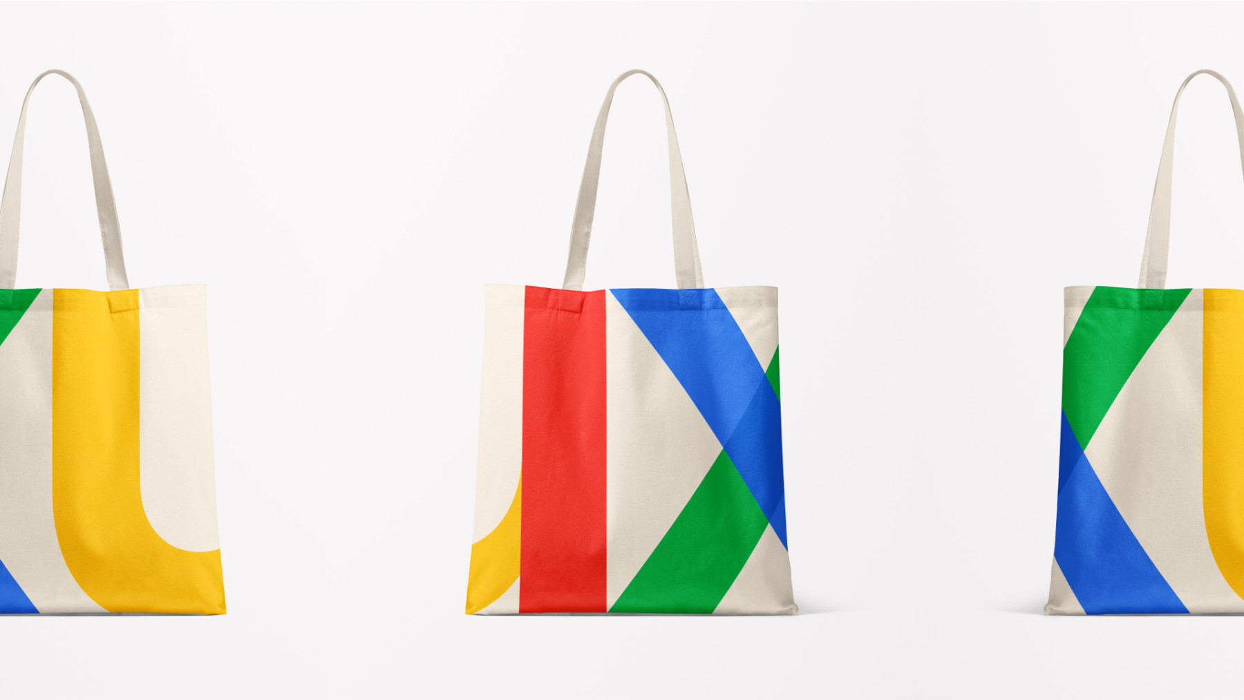
Transparent, overlapping shapes reinforced the organization’s collaborative workflow while tight spacing between the elements added a sense of energy and movement, representing the forward-thinking approach of Core UX. At the same time, vibrant colors and curved letterforms created an approachable, friendly feel consistent with the Google brand.

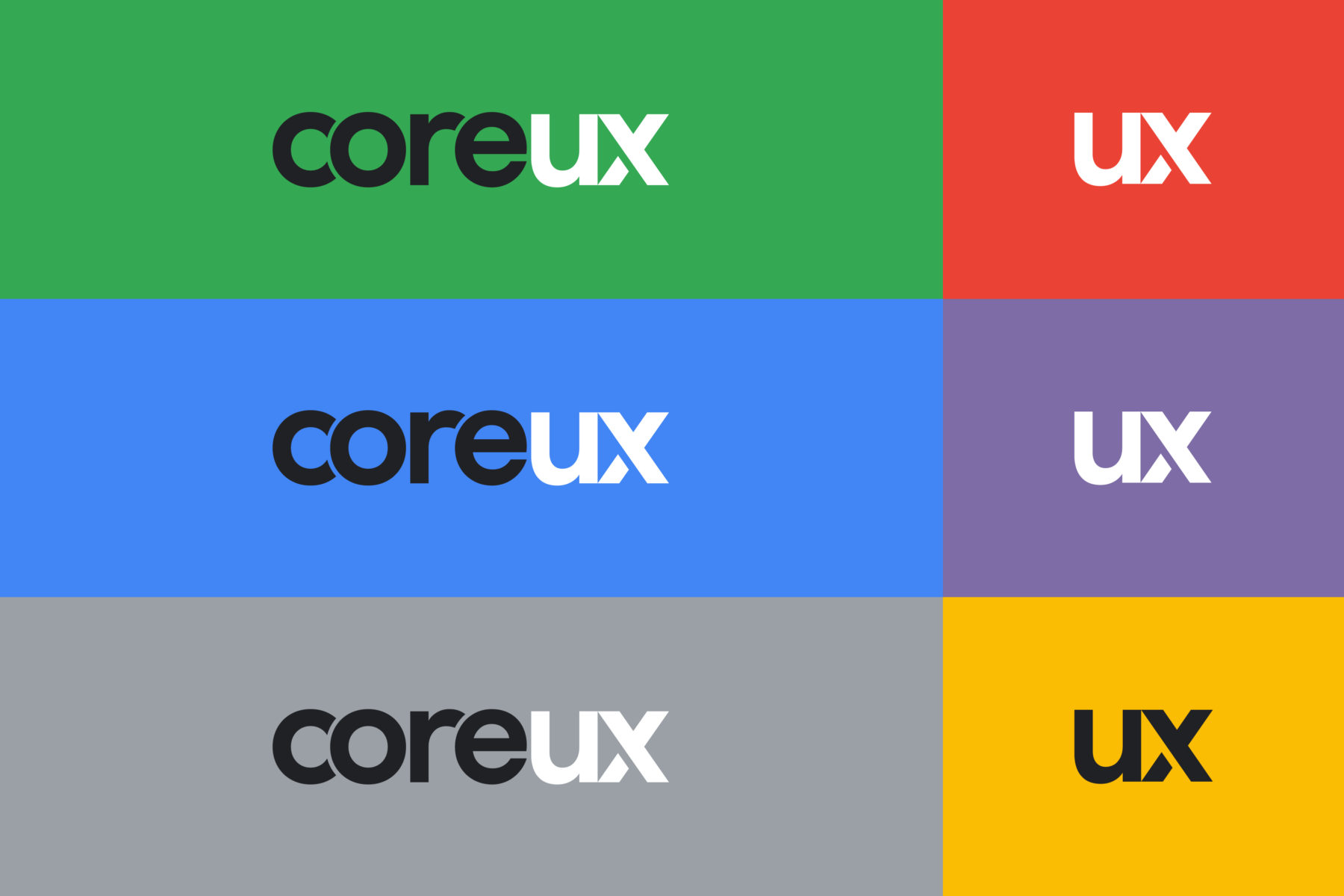
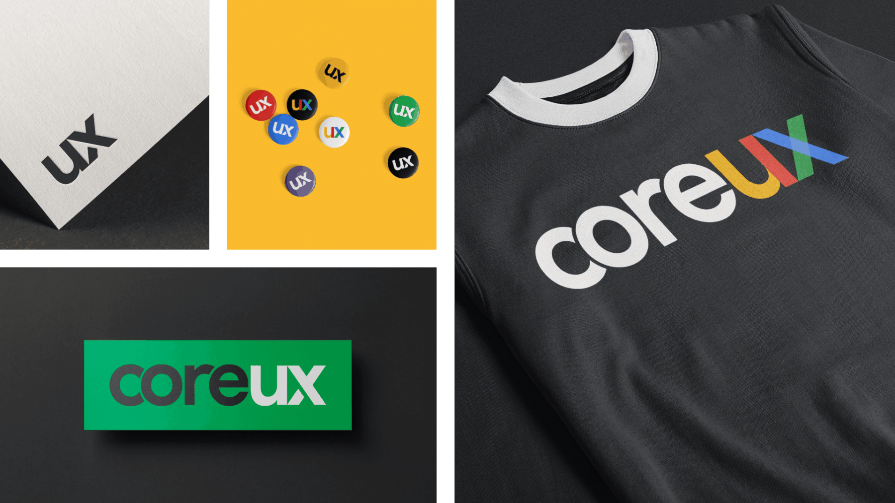
Once we settled on a logo, we worked together to create a set of guidelines outlining how the use of type, color, and layout could extend to merchandise, posters, buttons, presentation slides, and more.
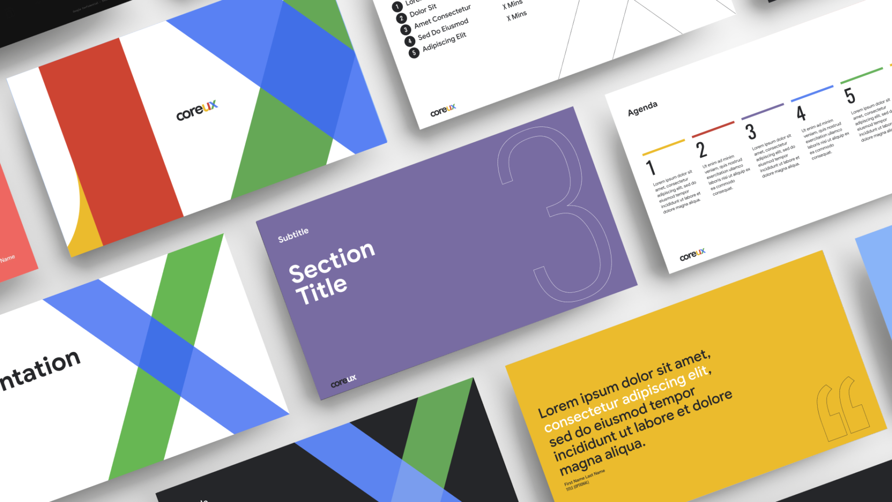
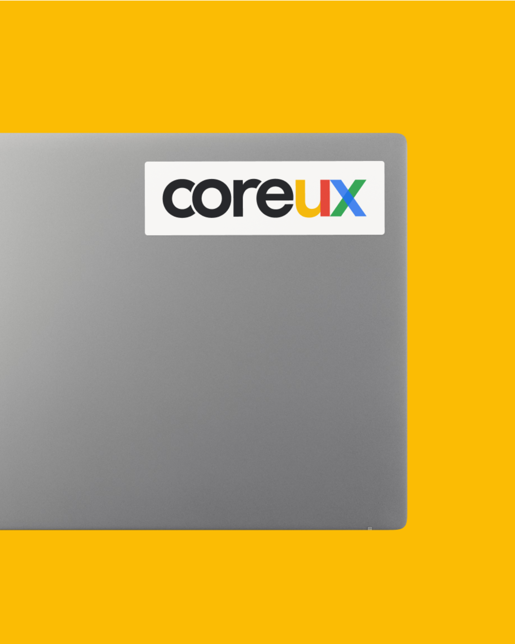
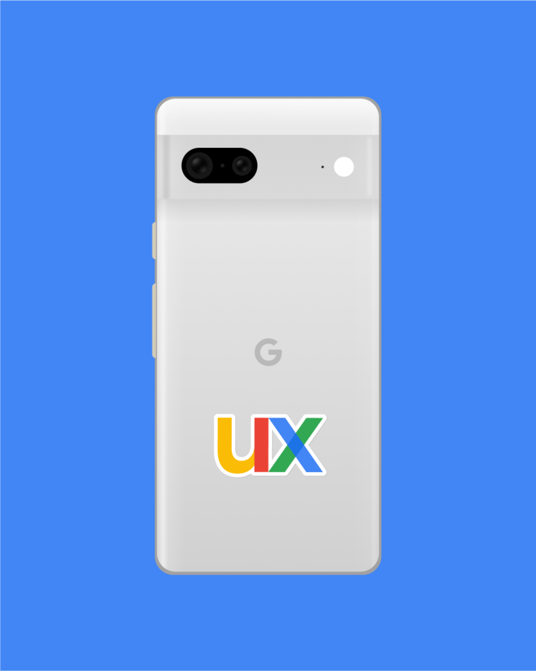
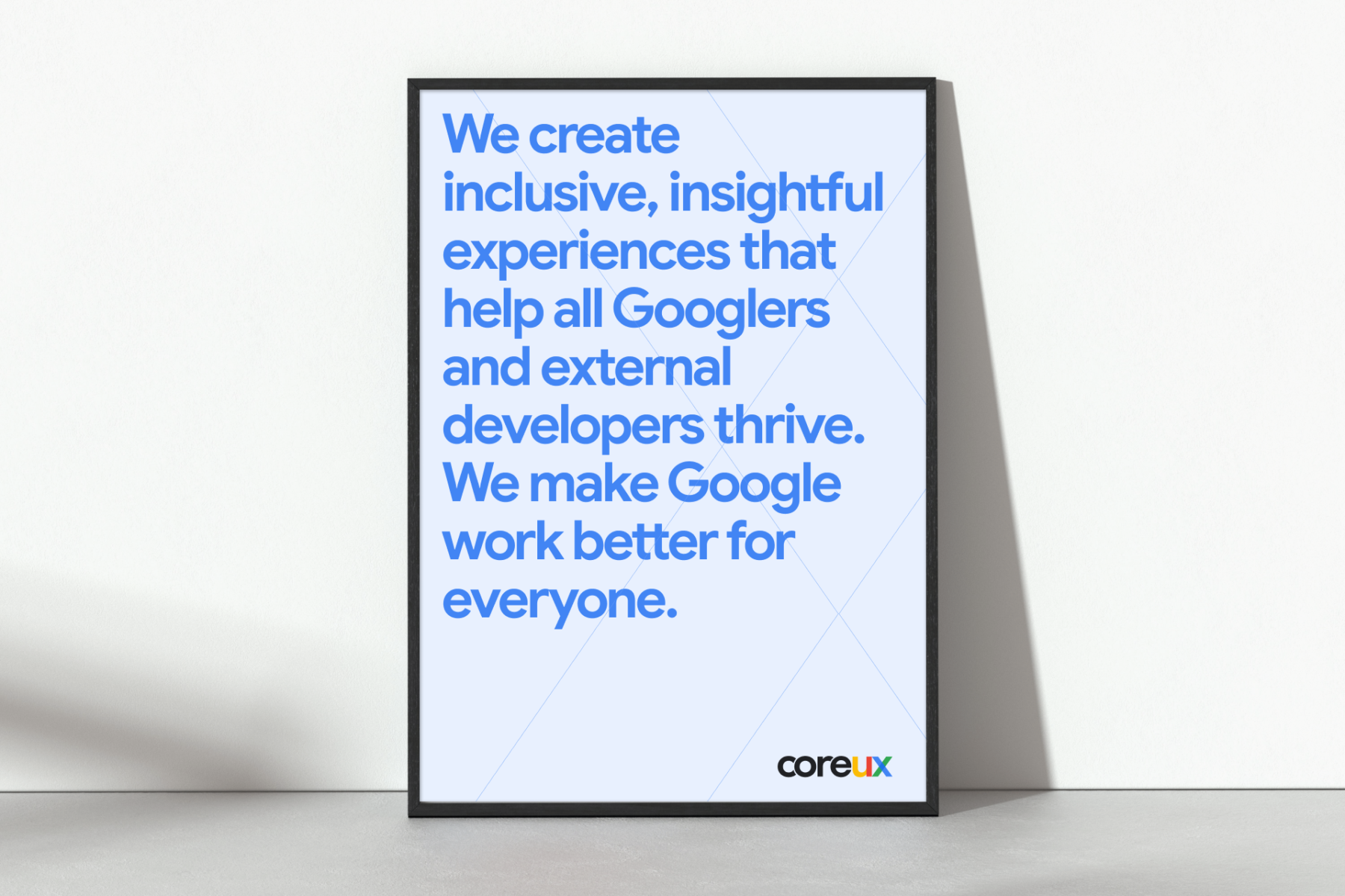
By the end of this collaboration, Core UX had a brand they could rally behind, a flag to fly high—but they’re not the only ones who thought so. Its official launch at the Core UX Summit in New York received rave reviews, sparking conversations among other internal organizations within Google as they reevaluated their own identities.
At the end of the day, brands will always shift and change, but we’re confident our successful team effort has created a solid foundation for Core UX to expand upon for years to come.
